Tuesday, July 28
Pencil Technique From Photo
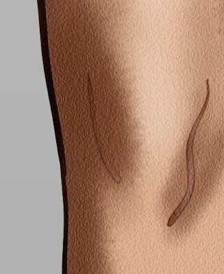
Here I have tried the new technique working from a photo by redrob2.co.uk. Seems to work. As always it will probably look better done from life.
Pencil Figure Drawing Technique
See the Blackboard Announcements for July 28th to view the 16 minute recording demo. I worked on finding some better techniques that would work in a life drawing situation. I found some hi-res images of Gil Elvgren's figure drawings on the Heritage Auctions site. I used the paper background to make a new paper that I could use as a background for any drawing. I sampled an even area of shading and defined it as a pattern. I then used the pattern stamp tool with my custom brush settings to paint back in the pencil texture. I use a fairly consistent diameter brush with opacity set to pen pressure for the shading and a size pressure brush with no opacity change for the line work. I was able to copy most kinds of drawing textures that he has fairly well.
Saturday, July 25
Figure Drawing
I did the figure drawing thing with Jeff, Ryan, Dustin, & Tony on Friday. It was hard to get into it after not having done it for so long. I brought in a laptop and wacom tablet. It is a lot of fun to be able to work in layers and change things if they don't work. I like how the line work is going but shading tools still are hard to figure out.
Thursday, July 23
Interpretation of DeCarlo Style
Tuesday, July 21
Old Cartoon Techniques DeCarlo
Monday, July 20
Textured Halftones and Illustrator Lines
Thursday, July 16
Process Test Model
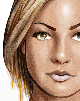
I did a trial process based on a few of the techniques that I have developed recently. I started with some photos of models from clothing retailers. I stitched together several different models in Photoshop to get the pose and clothes I wanted. Then I redrew the figure with the blob brush in Illustrator. Then into Photoshop for coloring and brush strokes etc... works pretty good. A little lifeless because the source was a photo.
Monday, July 13
Matt Smith Illustration
Here is a study from an illustrator named Matt Smith. See his website here: http://www.matt-illustrations.com/index-kids.html
Original is on top, copy on bottom. I did the linework in Illustrator with the blob brush then imported to Photoshop for everythign else. I still need to figure out a better way of doing the lighter version of the line drawing. His has a lot of great texture that burns into the image.
Saturday, July 11
Randall Whiteis Study
I saw in Jacob's blog a study that he had done from an artist named Randall Whiteis see his site here: http://www.randallwhiteis.com/
He uses crisp vector lines with smooth airbrushy shading. I did a study of one of his pieces here. The original is on bottom. It starts with lines in Illustrator. I kept all of the shading separate from a local color layer. I left more of the original dark vectors in the head than he did. I also changed head and other areas a little.
Wednesday, July 8
Clay models as a starting point
Friday, July 3
Application of Watercolor Technique 1
New Watercolor
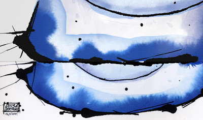
Here I have another study the top portion is my copy of the bottom. I created two new brushes to do this. The first is the fuzzy brush for the wet on wet look, and the second is a lumpy spot for the line work. I used the photocopy filter to get the edge reticulation (darkening). This was done entirely in Photoshop with a wacom tablet.
Thursday, July 2
Watercolor Tests
Here are 3 versions of the same image. The first one with the paper texture I did using entirely Photoshop. The second one is done entirely in Painter. The last one with two garlics is the original.
I got more of what I wanted out of Photoshop with the watercolor than I did from Painter. I took a big speckley brush and opened up the spacing and jittered the angle. I masked those marks with a bristley brush set to wet edges and used that same wet edges in overlay to get the way that watercolor marks look darker at their edges. I think Painter does a much better job at the loose ink brushwork. I wasn't doing a good job of matching the saturation in the photoshop version.
Wednesday, July 1
Fantasy Painting in Photoshop Test
Subscribe to:
Posts (Atom)